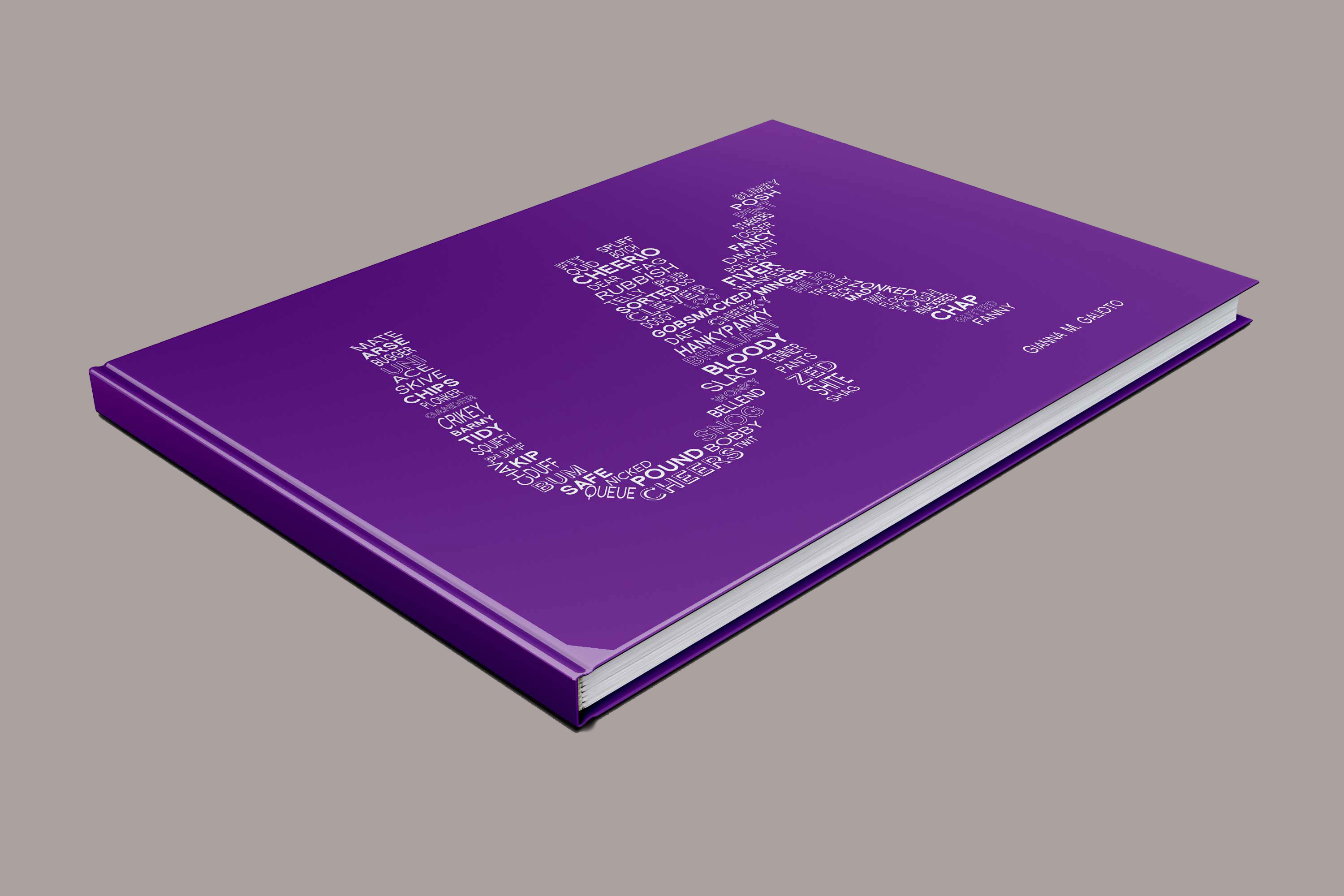
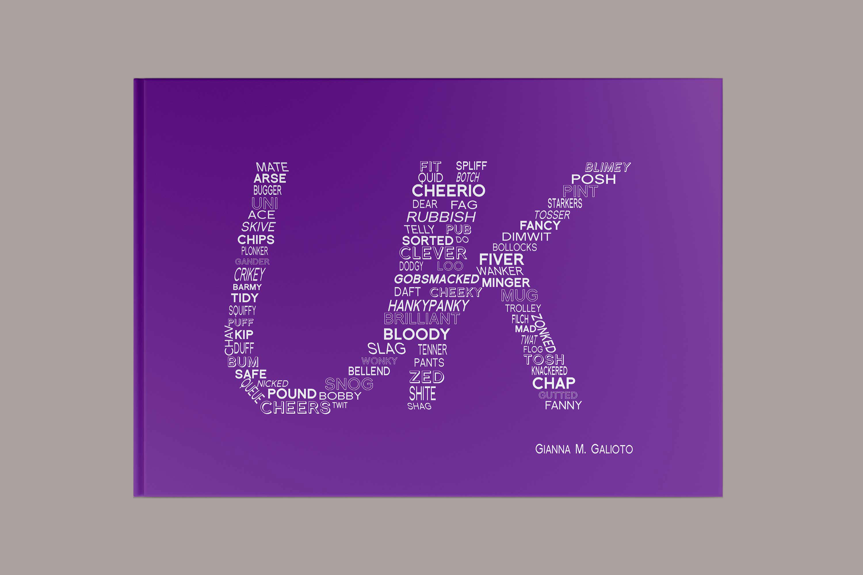
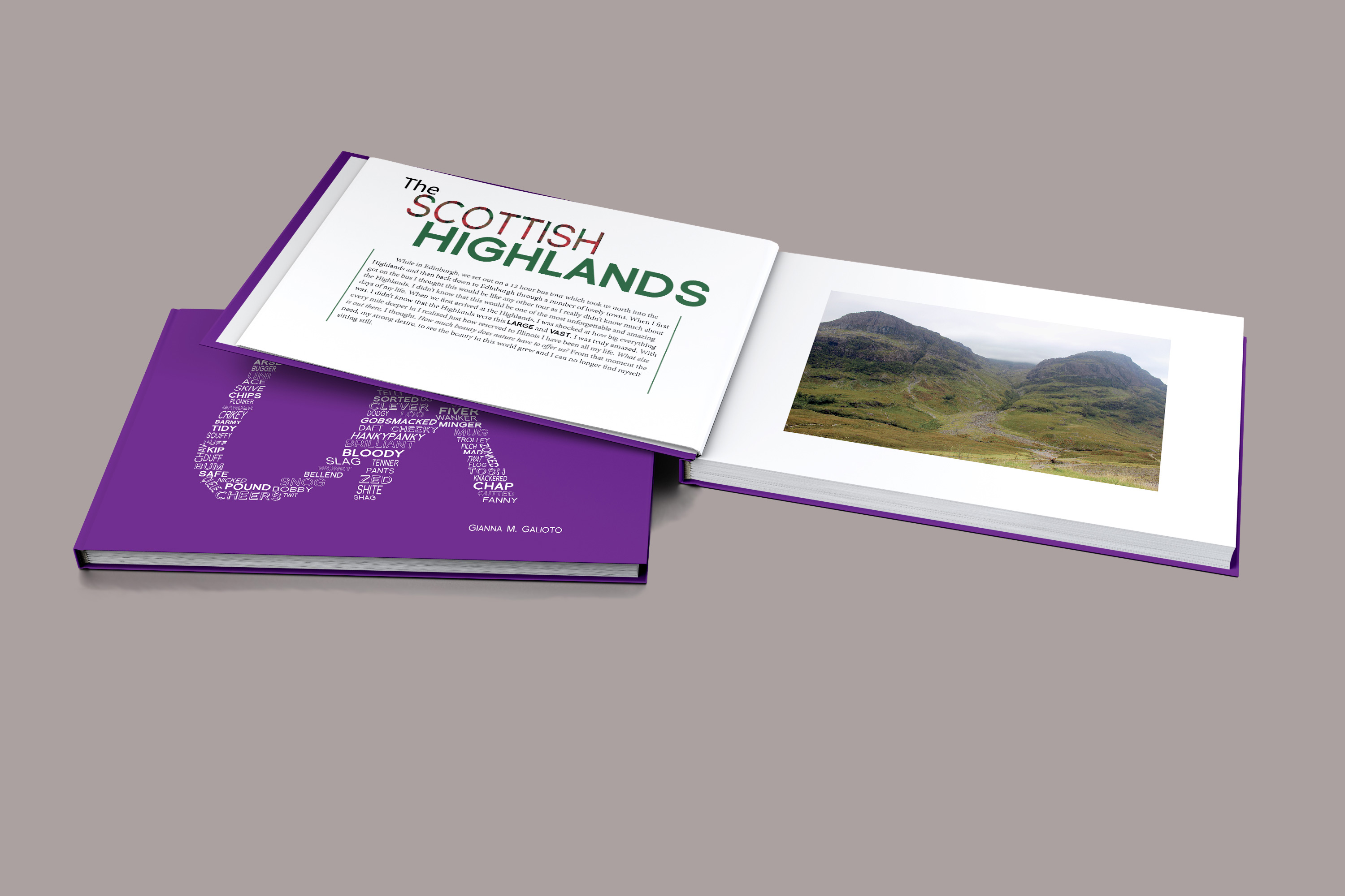
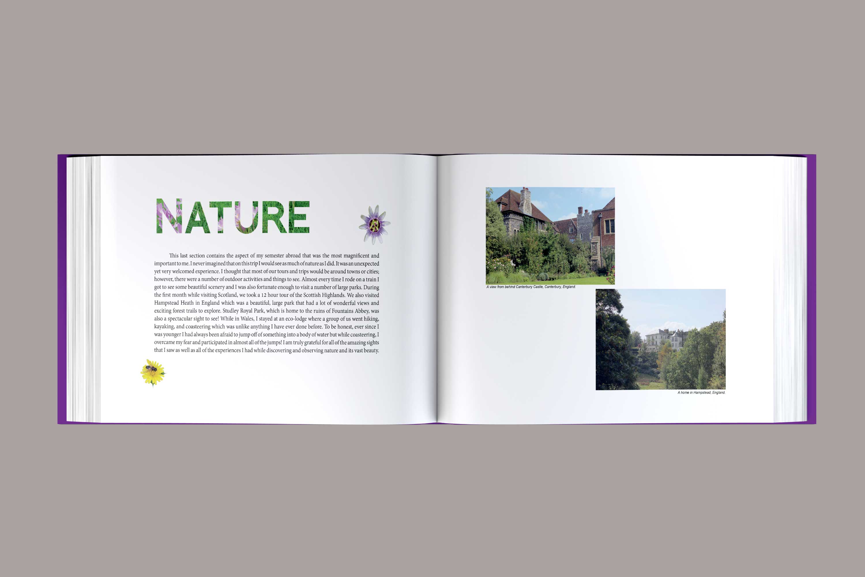
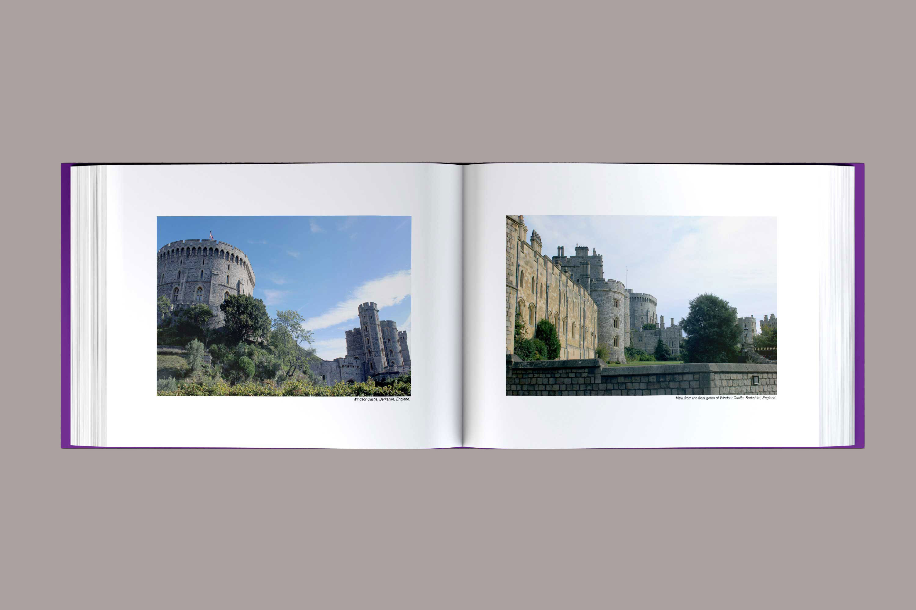
This was a visual response to my semester abroad in the United Kingdom. While I was there I had to complete a tutorial project and decided to design a book about my experiences abroad. In this book I had to focus on content, layout, typography and consistency. For the cover I created the letters ‘U’ and ‘K’ using British slang that I learned while there. For the inside, I focused heavily on type and image. All of the photos used were ones that I captured while traveling. This was my first time designing a book and at first I struggled with deciding on my main subject as well as narrowing down my images, but once that was solved, the process went smoothly.